Article Summary: The best lead generation landing page combines research, human psychology, webpage design, and copywriting best practices to create a compelling offer and increase form completions. Remember: Your landing pages are never truly done. You can always continue to enhance them based on your data to increase conversion rates!
- - -
Your website has the potential to be incredible. And I’m not talking about visual appeal. With the right systems in place, your website can be the cornerstone of your overall marketing and sales strategy, turning site visitors into leads and leads into sales.
It all hinges on landing pages—those sophisticated, mid-campaign lead capture pages that turn curiosity into sales opportunities.
Think about it for a second…
- Say you sell widgets for $1,000 per widget.
- You close 25% of your leads.
- Your landing page converts 4% of its visitors into leads.
- Your ad campaign sends 100 site visitors to your landing page every day.
Let’s do the math here: You send 100 visitors to that landing page. Four of them turn into leads. One of them closes, netting you a cool $1,000. Over the course of a month that single landing page generated $30,000.
That is the power of a well-oiled website.
We actually discuss this type of thought process more in our marketing and sales ebook, so be sure to check it out for a free download—and to see how we built that landing page.
This isn’t science fiction or some too-good-to-be-true fantasy. This can be your reality with strategic lead generation landing pages.
Read our full blog to learn more.
Table of Contents
Landing Page Benchmarks
Landing Page Vs Homepage
So… Do I Need A Website For A Landing Page?
Landing Page Copywriting Secrets
The Art & Science of the Landing Page Form
Examples of Great Landing Pages
Don’t Stop At the Landing Page
Find Hands-On Support
Lead Generation Landing Page FAQ
Landing Page Benchmarks
A 2024 analysis by Unbounce of 41,000 landing pages found the average conversion rate across all industries is 6.6%.
But that number can vary wildly by source and industry. A different study cited by Waypoint Converts shows the average landing page conversion rate is 4.02%, but the general span is 2.35%–4.14% across all sectors.
For additional reference: At Poetica Marketing, we always aim for 5%–10% for our clients.
So, what does all of this actually mean?
Well, if you send 100 people to your landing page and seven of them convert, you’re doing well, at least according to our two cited surveys.
That said, you should always weigh performance against:
- Your industry benchmarks.
- Your own company’s previous benchmarks.
Work to make incremental improvements over time—as we explain later in this article.
Landing Page Vs Homepage
Here’s a question we’ve heard in the past:
Do I really need to make a landing page? Can I just send them to my homepage?
Nope. 100 times out of 100, a dedicated landing page will outperform your homepage—no matter how great your landing page is.
Don’t believe me? Check out this story I shared on LinkedIn:
A Real-Life Case Study: 13X Improvement
One of our clients decided to work with an advertising agency to run ads for attendees at a recent industry trade show.
It was a great idea in theory; everyone who attended that trade show was a potential customer for our client.
Unfortunately, the ad agency simply sent everyone to the client’s homepage—without any reference to the ad or the trade show.
The average time on page? 3 seconds. And most users simply vanished from the website immediately after arriving.
We recommended a dedicated landing page unique to the campaign. So, we drafted some copy, the client built a new landing page, and the ad agency redirected the ads.
On the new landing page, the average time on page shot up to 40 seconds—13X more than before!
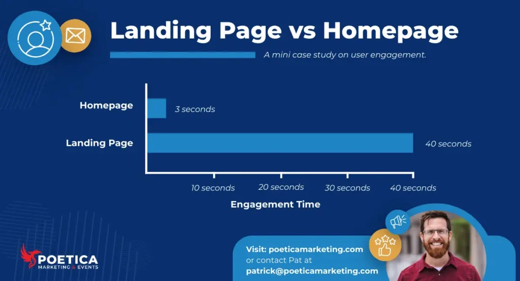
Landing Pages Trump Homepages
To put it simply: If you’re running any sort of campaign that directs traffic to take a specific action, you should have a dedicated landing page that aligns with that action and the campaign’s specific audience.
And that’s the beauty of the landing page: You can customize the landing page to suit any purpose. You can’t do that with your homepage!
But you can create an endless number of landing pages to suit specific parts, audiences, and goals within your campaign.
So… Do I Need A Website For A Landing Page?
Well, yes and no.
Having your own website is always a plus, but if you don’t have a dedicated website for your company, you can use a tool like Unbounce to build a standalone landing page for the length of your campaign.
It’s not technically a website, but it is a webpage.
Landing Page Copywriting Secrets
I love writing landing pages because they’re a perfect blend of art and science. Writing a great landing page requires:
- A deep understanding of the page’s value
- A deep understanding of the audience’s pain point
- A deep understanding of your brand
Landing Page Copywriting Tips
Before we get into landing page-specific copywriting tips, we should talk about copywriting tips in general. We’ve already hosted a copywriting mastermind, but I also recently shared some best practices at a live networking event.
General Copywriting Tips
As I mentioned in the video above, here are three copywriting best practices that’ll help you stand out:
1. Be Precise and Succinct - One of my all-time favorite writing tips is Omit needless words. Another one: Strive for the best words in the best order. When you combine these two together, we learn that great writing is precise (word choice) and succinct (gets the message across without meandering).
2. Steal Formulas - This is especially important for landing pages, which rely heavily on formulas—and we’ll look at one below. Yes, there are ways you can further customize your landing page to increase conversions, but you don’t need to recreate the wheel (and the same goes for your other marketing efforts as well).
3. Focus On Value And Solutions - I had a Philosophy teacher in high school who used to say, “Nobody cares about your opinion. Instead, they care about your informed opinion.”
Well, no one cares about the service or product you provide. After all, they can get the same thing from your competitors. Instead, they care about the solutions you offer and the value you deliver. Focus on the end value, and your writing will pop.
Landing Page Copywriting Best Practices
Here’s what to think about when you start writing specifically for your landing page:
1. Juice Up Your CTAs - The default language on a landing page is to label your CTAs and buttons with copy like “Click Here” or “Download Now.”
But this is generic and uninspiring—and it doesn’t follow our tip to focus on value. Examples of value-driven CTAs may include:
- Master Copywriting Today
- Accelerate Your Business Growth
- Convert Your Site Visitors
2. Leverage Bullets and Numbered Lists - Take another look at how we’ve structured this blog post.
Notice all the bullets and numbered lists?
The reason we do that is to make the copy “scannable” for the human eye. Thanks to this formatting, readers can quickly peruse the copy to identify the value within.
That’s a huge benefit on your landing pages, as you can convince your visitors to follow through on your CTAs without overwhelming them with huge blocks of text.
3. Incorporate Number-Driven Facts. Whenever possible, show how your content can benefit the reader. You might promise:
- Techniques to improve outcomes by 25%
- Strategies for saving 30%
- An outline to 3X sales
Whatever you do, make sure it’s something you can back up with facts. In our marketing and sales ebook, we promise a 10%-20%+ increase in sales close rate because we used the same strategies to boost our close rate by 20%.
4. Leverage Social Proof. Including reviews, testimonials, awards, and other trust signals can increase the likelihood of someone converting. 90% of consumers check reviews before making a purchase, and researchers at LanderLab suggest social proof can increase conversions by a whopping 340%.
That’s huge!
The Landing Page Formula For High Conversion Rates
Here’s a simple-but-effective landing page formula you can use for increased conversions:
1. Attention-Grabbing Headline - Your headline should be quick and snappy, and it should root the reader in place. To quote one of my editors from the beginning of my career: The purpose of your headline is to get the reader to read your first sentence...
2. Value-Driven Promise - Once you’ve grabbed the reader’s attention with the headline, it’s time to make a promise that compels them to continue reading and/or fill out your form. To continue to the quote from my editor: The purpose of your headline is to get the reader to read your first sentence... The purpose of the first sentence is to get them to read the rest of your article.
3. Form - As we’ll discuss momentarily, the way you set up your form matters. For now, know that your form should generally appear relatively high on the page (and many argue it should go “above the fold,” especially on desktop.
4. Social Proof - As we mentioned a moment ago, social proof—customer reviews, testimonials, and company awards—can be invaluable trust signals that help convert simple page visitors into potential customers who eagerly complete your form.
5. Key Benefits - Time to list out the benefits of filling out your lead generation form! This is the perfect opportunity to focus on the value of your lead gen content. Tip: Use bullets and numbered lists to make your content easier to read!
6. Second CTA - After reinforcing your value and benefits, ask again—confidently and clearly. Use outcome-driven language that focuses on the transformation, not generic phrases like “Submit” or “Click Here.”
7. More Social Proof - At this stage, your reader is evaluating trust, so reinforce it with testimonials, results, or recognizable brand signals. Social proof provides the logical reassurance that supports an emotional buying decision.
8. Additional Benefits - Address lingering objections and restate the transformation your offer delivers. Help the reader connect the dots between a simple form submission and meaningful business impact.
9. Third CTA - End with a bold, unmistakable next step that makes conversion effortless. If they’ve made it this far, they’re interested. Remove that last bit of friction and give them a compelling reason to take action.
If you’d like, you can continue to mix and match sections here.
The Art & Science of the Landing Page Form
A few rules to follow:
1. Less Is More
In general, every extra form field decreases the likelihood of a conversion—with some exceptions.
Only ask for what you need—and cater your questions to your next steps
As we talk about later, your landing page is only part of a longer sequence. Some thoughts:
- If you plan to call, you need a phone number.
- If you want to send an email, you need an email address.
- If you want to address someone by name, you need their first name.
In general, we recommend asking for a first name and email address, but there’s research that shows more is OK.
In fact, the highest converting forms have 1, 4, or 7 fields (and, believe it or not, 7 actually outperforms 4).
2. Where You Place the Form Matters
We’ve seen conflicting data. Many of the top-performing landing pages have the form field above the fold, while other experts recommend including the form 40% down the page so you have an opportunity to sell your value.
Our recommendation: Show it high, but don’t be afraid to repeat it as you continue to promote the value. And if you don’t want to repeat the same form, include a CTA button that anchors links to the form higher on the page.
3. Reduce the Need for Typing
Clicking and text fields and typing out answers line by line creates friction. Some ways you can overcome it:
- Enable autofill options
- Use sliders and dropdowns, when appropriate
- Allow people to sign up via their Google or Apple accounts, when possible
Removing just that tiny bit of friction can provide a small but meaningful lift in conversions.
Examples of Great Landing Pages
Find inspiration in these gorgeous, high-performance landing pages:
1. Kit - Features Page
Link: https://kit.com/features
Why It’s Great: Look, I’ll be honest: I gushed about this page in our team Slack channel after I came across it. It’s just so… good.

For starters, just look how brilliant that headline is: The email-first operating system for serious creators. That sort of exclusivity anchors the reader in place, helping them recognize the gravity of their own goals and attracting them back to the Kit platform.
Then there’s that dashboard snapshot off to the right—with plenty of green arrows and percentages indicatng growth.
This is an aspirational play, and the psychology here works.
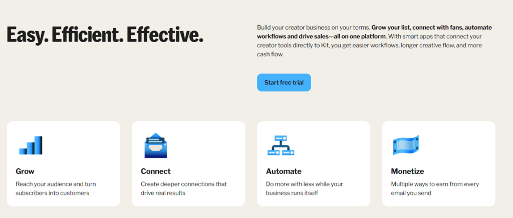
Look how easy this is to scan with your eyes. On my first perusal of this page, I didn’t even read the paragraphs; I simply looked at the icons and read the two lines underneath them.
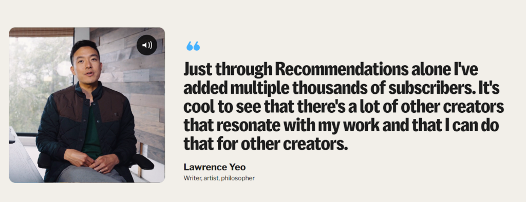
Here’s where things really get “sticky” on this page. Kit has set up testimonial videos to autoplay on this page as you scroll by, and they’re excellent quality. And if someone doesn’t want to watch, a big, fat quote sits right beside it to show off some hard-earned social proof.
For the rest of the page, Kit alternates between demonstrating values and showing more testimonial videos.
By the time I got to the bottom of the page, I felt great about Kit as a potential fit.
Editor’s Note: This content is not sponsored by Kit, and we don’t use Kit for Poetica. We were evaluating Kit as a potential tool for one of our clients.
2. Calendly - Individual
Link: https://calendly.com/solutions/individuals
Why It’s Great: This page is all about value. It starts off aspirational like the Kit page (note the use of the word “genius,” but pay attention to words and phrases like “work smarter,” “efficient,” and “achieve success.”
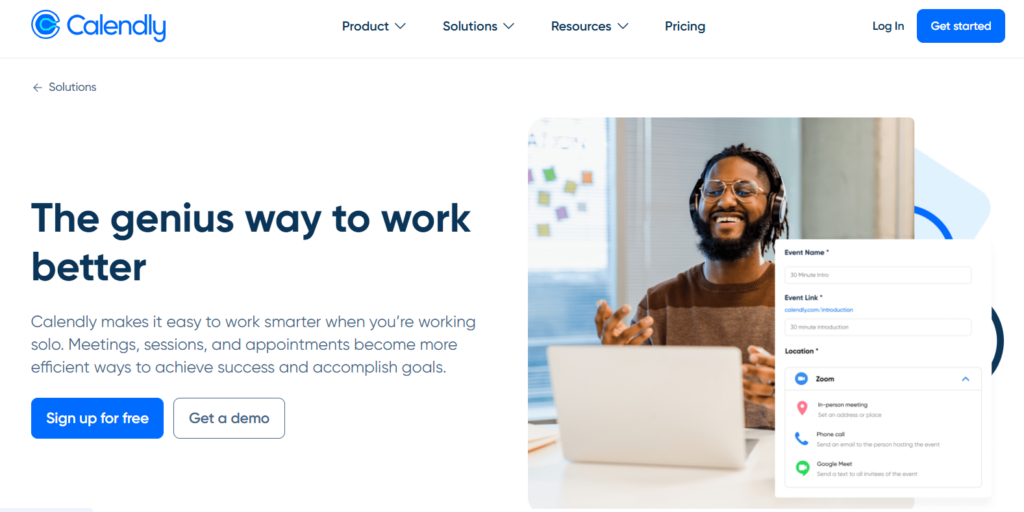
Calendly cleverly includes two CTAs here—one for people who are ready right now, and one for people who need to schedule a demo because they need to see it in action first. This helps Calendly prevent bounces from people who aren’t ready to convert right now.
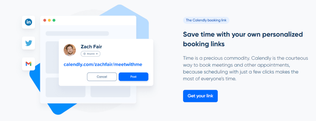
This Calendly page also focuses on value both within its copy and its CTAs. In the section above, the company highlights the value of personalized booking links, then uses “Get your link” in the button—a powerful one-two punch.
Calendly smartly follows this formula for the remainder of the page, gradually encouraging visitors to either sign up or book a demo to learn more.
3. The Motherhood - Influencer Marketing eBook
Link: https://www.themotherhood.com/influencer-marketing-success/
Why It’s Great: This landing page leverages an old-school (but effective) landing page tactic: It strips away the navigation bar and all other outbound distractions. Visitors have only two options: Convert or leave.
The copy here is equally powerful. Instead of waiting until later on the page to demonstrate authority or social proof, The Motherhood comes out right away with “20 Years of Award-Winning Influencer Marketing”—a powerful start.
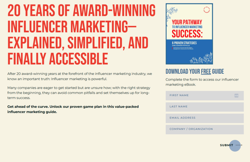
Pay attention to word choice here. The Motherhood plays on the competitive nature of marketers and business owners by using the phrase, “Get ahead of the curve.”
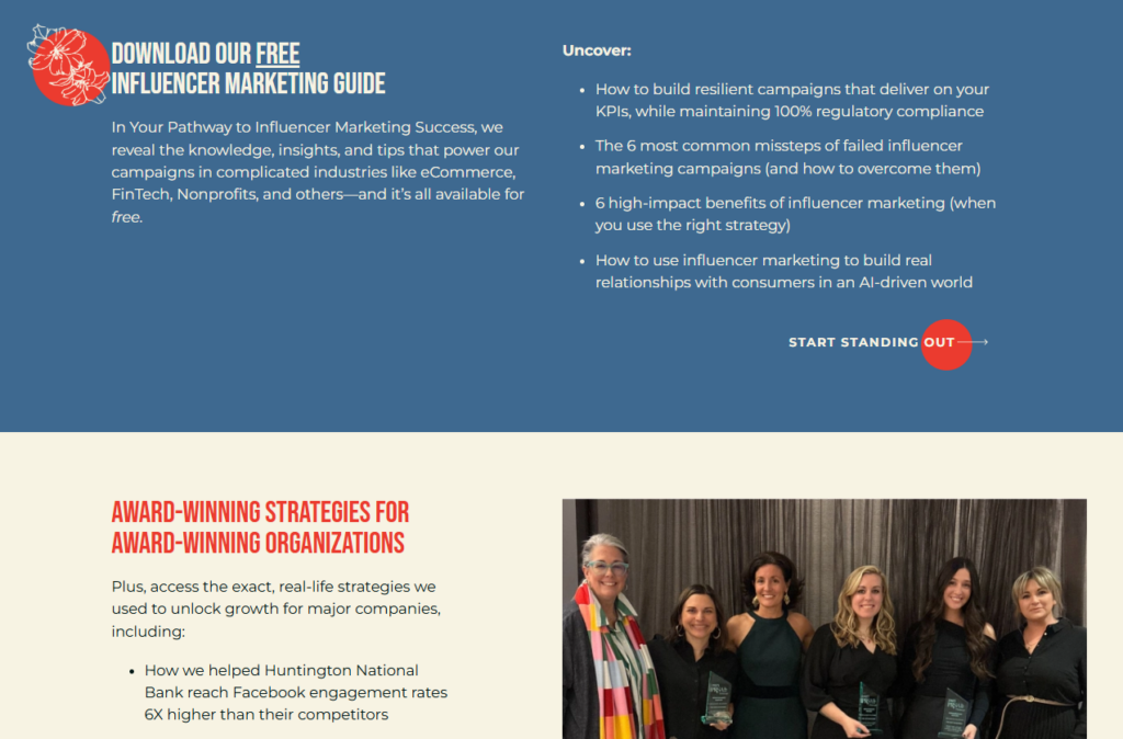
The Motherhood also takes an unusual strategy here: They showcase the team that developed the content. This allows the site visitor to develop an emotional connection with the smiles on the page—subconsciously developing trust and increasing the likelihood for a conversion.
Don’t Stop At the Landing Page
Remember, a landing page is only one part of a longer sequence for your target audience.
In general, the user life-cycle looks something like this:
Ad / Triggering Action → Landing Page / Form → [ Something Else ]
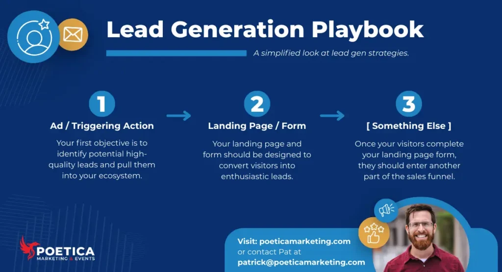
That [ Something Else ] could be many things. It could be:
- Automatically transferring the visitor’s contact information into your CRM.
- Automatically entering the visitor into an automated lead-nurturing sequence.
- Automatically notifying you or a salesperson to contact the visitor to discuss their needs.
- Automatically thanking the visitor (via email or text) for completing the form or taking a similar action.
With that in mind, your work doesn’t stop just because you completed a landing page.
Find Hands-On Support
If you’re ready to maximize the value of your landing pages, contact us.
Our data-driven team combines science, copy, and design to create high-converting landing pages to kickstart your sales process with quality leads.
Plus, we can provide lead-nurturing campaigns that turn those simple form fills into engaged leads that gradually become more and more ready to convert into enthusiastic customers.
Lead Generation Landing Page FAQ
What is a good lead generation landing page conversion rate?
Industry averages range from roughly 4% to 6.6%, and at Poetica Marketing we typically aim for 5%–10%, but performance should always be measured against your industry benchmarks and your own historical data. Ultimately, what matters most is whether your landing page is generating profitable, high-quality leads—not just a percentage on a dashboard.
Can I just send traffic to my homepage instead of building a landing page?
You can, but you shouldn’t—homepages are built for exploration, while landing pages are built for conversion. As shown in our real-world example, switching from a homepage to a campaign-specific landing page dramatically increased engagement because it aligned directly with the ad and the audience.
Where should the form go on a landing page?
Some experts recommend placing the form above the fold, while others suggest positioning it slightly lower to allow room to communicate value first. Our recommendation is to place it high on the page and reinforce it throughout with additional CTAs or anchor links to make conversion easy at any stage.
How many form fields should I include?
In general, fewer fields increase the likelihood of conversion, though some data suggests that 1, 4, or even 7 fields can perform well. The real question is what information you need for your next step—collect what’s necessary, and optimize from there.
Is a landing page ever truly finished?
No. Lead generation landing pages should continuously evolve based on conversion data, engagement metrics, and lead quality. Even small incremental improvements can significantly impact revenue over time, so optimization should be ongoing.