Anyone who was online in August of 2025 remembers one of the business world’s biggest marketing and branding snafus.
We’re talking about the botched Cracker Barrel rebrand.
To be honest, I actually quite like Cracker Barrel (Where else can you get a plethora of side dishes for under $13?). But even I couldn’t get behind the tragic abandonment of the company’s visual identity. It was so stripped of its originality, I even made a point of addressing it in our Back to (Business) School webinar series:
Cracker Barrel might have grabbed the headlines for its terrible new logo, but it wasn’t quite fair.
Tons of brands have bad logos. Even worse than that short-lived Cracker Barrel one.
The problem is even more prevalent among small- and medium-sized businesses with limited marketing budgets.
Today, we’ll explore the biggest issues I see plaguing company logos and what you can do to correct any issues your logo might have.
Table of Contents
5 Common Logo Mistakes
3 Examples of Bad Logos
Checklist for Reviewing Your Logo
Find Support For Your Logo
5 Common Logo Mistakes
Here are a few of the most common mistakes we see companies make with their logos:
1. Using Hard-to-Read Fonts
There’s a fine line between a font that looks cool and a font that’s hard to read, and crossing that line could damage your brand.
I see this happen all the time, especially in industries where solopreneurs offer elevated experiences (think real estate agents and wedding planners).
These business owners often use Canva and other tools for beautiful templates, but they commit the mistake of going with the default options Canva suggests. This leads them to incorporating frilly, luxurious fonts that are overused and too hard to read (We’re looking at you, script fonts!).
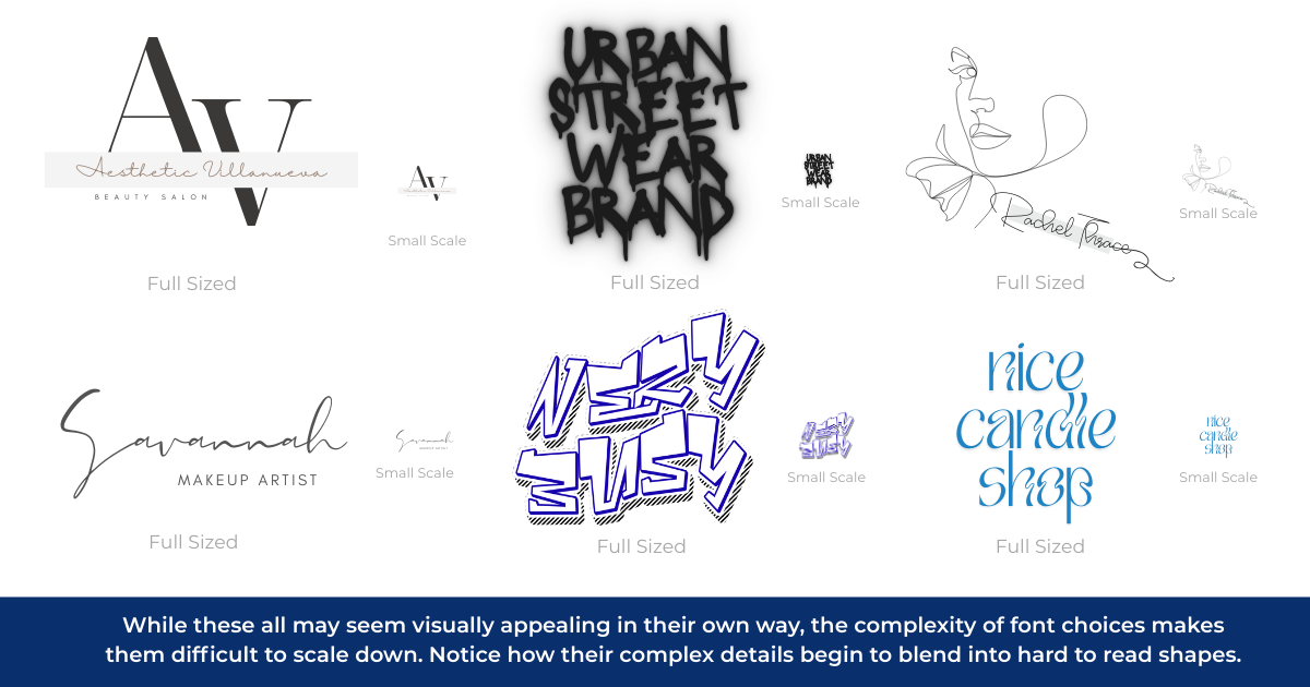
If you absolutely love a font but are worried it’s too challenging for readers, don’t give up hope. It’s more than possible to customize the font a little further so it’s readable in your logo.
Take note: The process should start with the style you feel best represents your brand (meaning it should align with your business and audience).
2. Using Too Many Fonts
Let’s get back to Design 101 for a moment:
At the end of the day, letters are shapes.
In design, we call the letters in a font “letterforms” because we look at them not just as symbols to create words but also as unique shapes that convey visual meanings.
At the end of the day, every font is merely a collection of letterforms crafted with a specific design system in mind.
For example, a font like Montserrat is highly geometric in nature; the Os are perfectly round, and the lines in the capital M and N are equal in length, with every letter appearing the same in width. Compare this to a font like Times New Roman, which has a mix of sharp and rounded shapes, as well as varying line thickness.

All too often do I see DIY brands with a confusing mix of fonts that don’t fit together quite right. While there is a place for putting two contrasting fonts together, it should only be done in the proper context. Otherwise, when pairing fonts, they should connect in style, width, and length.
Here are a few rules and ideas to help you navigate your logo font choices:
1. Stick to One or Two Fonts
As a general rule, limit your logo to one or two fonts. In rare instances, a third might be appropriate.
But if you’re reaching for a fourth font during your logo design, you’re doing too much!
2. Pay Attention to Serif and Sans Serif Fonts
Serif and Sans Serif fonts both have their own unique impact on readers. For example:
- Serif Fonts: We’re used to seeing serif fonts in text books, classic literature, and newspapers, so these serif fonts have come to symbolize elegance and refinement.
- Sans Serif Fonts: Sans serif fonts exploded in popularity during the Art Deco movement, and they’ve grown even more common in the digital age because they’re easier to read on screens. Because these fonts combine organic and geometric shapes, they’re better for creative, accessible brands.
3. Consider the Length of Your Company Name
If you have a short name with only a few characters, you can probably get away with a more complicated font. But if you have a long or complicated name, you should stick with a simpler font for readability.

4. Contrast is Key for brands who want to differentiate themselves
If you have a brand that wants to make a major impact or stand out in a unique way, looking for contrast can help in this endeavor.
However, you want to be careful to still carry some elements between the fonts chosen.
Some ways I approach this is by pairing two Sans Serif fonts, but one has wider letters than the other. Or I might interject a unique serif element (like an ampersand) inside a sans serif font if possible.
It is easy to get carried away when trying to balance contrasting elements, so be sure to also partner this with Rule #1.
If you’re looking for some help pairing fonts, TypeWolf is an excellent resource to start with.
3. Using Clashing Colors or Colors Without Enough Contrast
I’ll be honest with you. Color is hard.
Some people have favorites. Some hate certain colors. And others can’t even see certain colors because they’re colorblind.
If you don’t have a background in color theory (And it’s OK if you don’t!), start with a logo color that feels strong compared to your competitors.
As an example, ask yourself:
Among my competitors, which colors do I see used all the time?
In the professional services industries, for example, we often see colors like navy blue and red (And, hey, we’re guilty of those ourselves at Poetica!). So, think about colors that work in the same context without coming from left field.
If you also work in the professional services, you might not pick hot pink, but you might consider a refined forest green or even a bright blue.
Another color tip: Pay attention to contrast. Pairing bright tones with neutrals can help you maintain a consistent palette without adding in distracting elements. As an example, take a look at our website for Waylight Psychological:

Waylight’s color palette came about very naturally. In our interview with the owner, she expressed a desire to evoke a feeling of tranquility, comfort, and welcome. I instantly made the connection to leverage a blue-led color palette with a range of tones that faded nicely into one another. This evokes a sense of calm, while the varying tones provide depth when layered together.
Still struggling with your palette? Here’s some quick tips to help you out further
- Pick one color, and then while staying in the same hue (such as green) choose a range of varying tones and shades to match it with (like forest green, bright green, and a sage green). Doing so ensures the colors will blend well together, while still offering variation in contrast.
- Black and white is always a classic for brands who want to appear elegant and minimalistic.
- Just like fonts, consider colors in their most common contexts. Red is often associated with passion, fire, and excitement, whereas blue is associated with calm, water, and peacefulness.
- Lastly, when all else fails, look up palettes online. There are millions out there to guide you!
4. Using Obvious Motifs
We’ve done a lot of work in the Real Estate and Home Services industries, and we’ve seen these companies use some version of a house in their logo over and over and over again.
It’s a self-fulfilling prophecy. Professionals see their competitors use this motif hundreds of times, so when it’s time for them to start their own business, they do the same thing because it feels safe.
You don’t have to follow the crowd.
Your brand is unique, and your logo can be similarly unique. Seek unique symbols that others aren’t using, or look at common motifs and consider ways they could be combined.
5. Treating Every Part Separately
Many of the worst logos we see (and are asked to refresh) seem to be slapped together from separate ideas. In these cases, the font seems too different from the icon, the colors clash, and sometimes certain elements are pixelated when everything else looks fine.
Remember when we said font is shape? Well, everything is shape. And it should all work cohesively inside your logo.
3 Examples of Bad Logos
So, now that we know what makes a bad logo, let’s identify some bad logos from pop culture. Believe it or not, some of the most common household brands actually have logos that violate some of our most important rules.
Some of logos worth critiquing:
1. Smucker’s
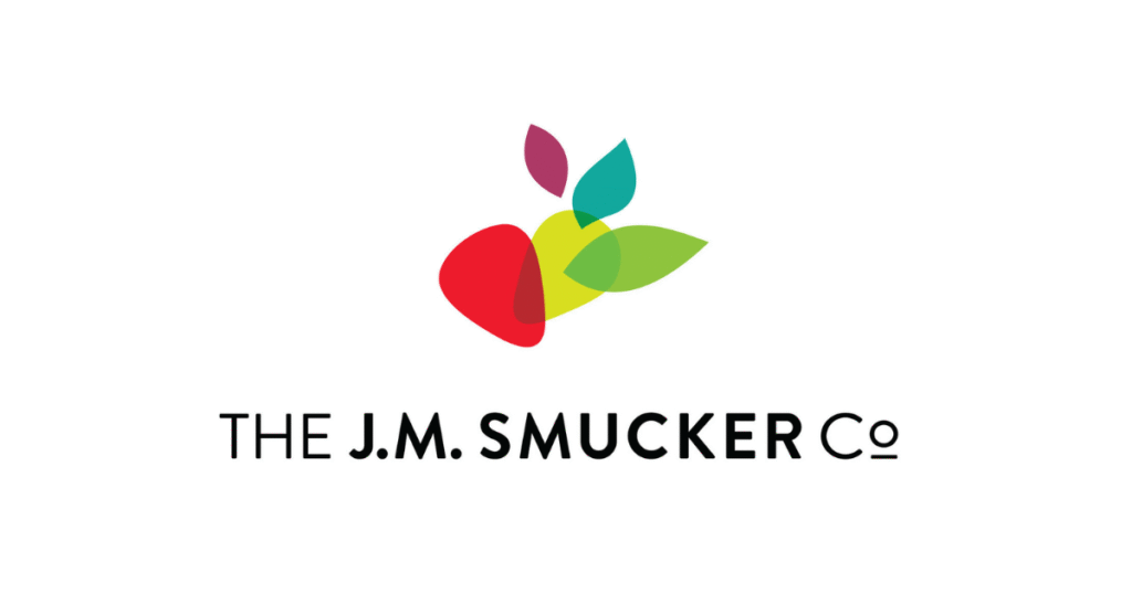
To be honest, I hated this logo when it first came out. It was such a turn away from that classic logo that we all grew up with when we were making peanut butter and jelly sandwiches, and it almost felt like a violation.
By itself, this isn’t a terrible logo. It’s dynamic with an interesting color arrangement. Sure, the colors are a little full, and the transparency is a dated choice, but Smucker’s largely follows our primary design principles.
That said, there’s one major reason why this logo is bad:
Great design is a marriage between design theory and what makes sense in the context. In case, Smucker’s doesn’t address the context of being a nostalgic leader in fruit and peanut butter spreads.
That’s a big miss.
2. Pepsi
The Pepsi logo is constantly evolving in an effort to feel young and hip to the newest generation of soda drinkers.
But the latest versions of the Pepsi logo have suffered from imbalances, abstract design, and a lack of internal awareness.
Take another look at their latest logo:
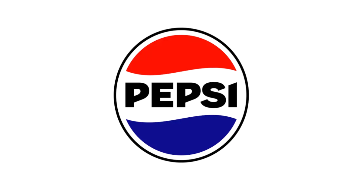
Right away, I note a few issues:
- Take a really close look at the text. Check the distance between the red and the top of the E. Then check the distance from the bottom of the S and the top of the blue. Visually, it looks like the E is closer to the color field than the S, which makes the text seem too high and off-center. You’ll also notice that the font choice is an eclectic mix of sharp and rounded shapes. The angle on the letter I feels forced compared to the fluid forms in the P and S. If there were other harsh angles in the shape, it might work, but the overall logo is fluid in nature.
- There is also the issue of the strong use of black in this latest logo. In the past, Pepsi always led with a minimal palette of blue and red, only ever using black in their logo in the 1960s. In more recent years, however, they’ve leaned more into the blue tones to help differentiate themselves from Coca-Cola’s iconic red.
Here’s the thing about black: While it can be a neutral color in most instances, it is also a very harsh color that tends to suck the life out of the more exciting colors around it. The only way to combat this is to make the pop colors extremely vibrant in comparison (such as a neon green or especially bright yellow). In the past, Pepsi’s color palette had this cheerfulness to it, often leveraging patterns in varying bright blues to give it a youthful edge. Here, the strong use of black makes it bland instead of minimalistic, and because of the tone of blue and red they’re using, the black causes them to feel dull and lifeless.
- There is also one major flaw many note about the Pepsi logo, and that is that it looks like a gas station (not an exciting soda brand). The outlined black circle and simple elements inside reads very similarly to brands like Gulf, Texaco, and 76. This brings up a valuable lesson: Considering cultural contexts of specific shapes and colors can help you avoid the comparison trap that even big brands fall victim to.
3. NASA

Look, I don’t want to throw any shade at an agency that got mankind to the moon. That’s a major feat.
But their logo needs work. It has so many elements going on, that it’s not surprising that even Nasa itself describes their original mark as “The Meatball.”
If you don’t believe me, imagine scaling this mark down to a 10th of its size. Notice how all those little stars and dots seem to disappear as you do.
You could simplify this logo without losing anything meaningful—and it would still be NASA.
Checklist for Reviewing Your Logo
If you’d like to audit your current logo, ask yourself these questions:
1. Does the logo feel right for your company and brand?
This is a big one: Does your logo align with the brand you’ve established? (Tip: Read our brand launch strategy for recommendations on solidifying your identity.)
2. Does the logo feel right for your unique audience?
It’s not just about you. It’s also about how your logo makes your target audience feel when they interact with it.
3. Does this logo work across the contexts you’ll use it in?
For example, will it work on a product, a brochure, and a billboard?
4. Does this logo standout or blend in?
If your logo was sitting in a room of all the logos in the same market, would it stick out or would it look like the crowd?
Find Support For Your Logo
If you need support on designing or refreshing your logo, contact us! We’d love to enhance your brand with you and the rest of your team.